Overview
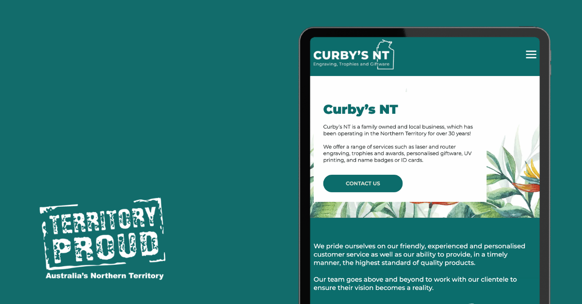
Curby’s NT, a family-owned gem nestled in the heart of the Northern Territory, is renowned for providing top-notch engraving, trophies, and awards. After over 30 years of excellence, it was time to give their online presence a makeover that matched their vibrant spirit.
Challenge
Curby’s NT faced the challenge of updating their website to better reflect their brand identity while ensuring a faster, more intuitive user experience. The goal was to transition from the Avada builder to the Breakdance builder without sacrificing the hard-earned SEO rankings. Additionally, the site needed to incorporate a fresh logo, bold branding colours, and creative graphics to resonate with their innovative approach.
Solution
Enter the creative squad armed with digital magic and a flair for design! Our mission? To transform Curby’s NT’s website into a sleek, modern masterpiece. Here's how we did it:
1. Platform Transition
We swapped out Avada for the nimble Breakdance builder, resulting in a cleaner, faster site. It’s like upgrading from a vintage bicycle to a high-speed motorcycle—the online equivalent of cruising through the digital highway with style. All within the WordPress space of course.
2. Branding Overhaul
Out with the old, in with the new! We applied Curby's NT’s spanking-new logo, bold branding colours, and a unique font style that screams authenticity. Now, every pixel on their site reflects their vibrant personality and their commitment to excellence.
3. SEO Retention & Enhancement
SEO isn’t just a buzzword; it’s the backbone of visibility. We made sure no pixel was left behind by meticulously retaining and building upon the existing SEO foundation. The result? A website that's as discoverable as it is delightful.
4. Service Updates
Curby’s NT offers a smorgasbord of services—engraving, trophies, awards, and more. We revamped their service pages to ensure visitors could easily find what they were looking for, engaging them with playful yet informative content.
Results
- Site Speed & Performance: The transition to Breakdance brought a significant boost in speed, ensuring a seamless user experience.
- Bold Branding: The new design elements capture Curby’s NT’s essence, enhancing their visual appeal and brand recognition.
- SEO Success: By carefully maintaining and enhancing SEO strategies, Curby’s NT continued to enjoy strong search engine visibility, attracting more local customers.
- Community Engagement: With a website that now better reflects their community-focused ethos, Curby’s NT has strengthened its connection with local businesses and loyal customers.
Conclusion
Curby’s NT’s website redesign is a testament to the power of combining creativity with technical prowess. By aligning their online presence with their authentic brand identity, Curby’s NT has positioned itself as a digital darling of the engraving and awards industry.
Want to give your website the Curby’s NT treatment? Let's chat about how we can bring your vision to life with a dash of playful creativity. Contact us today!


